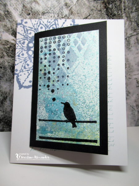
Hi Everyone, I'm over at Magenta with a card on a card. I hope you head over and see how I made this card.
Stencil and Stamps used

Card Recipe
Stamps: Magenta
Paper: 110lb White, Black, Linen Texture White
Ink: Ranger Distress Oxide, Versafine Clair Nocturn
Accessories: Stencil, Clear Embossing Powder
Techniques: Stamping


13 comments:
wow this is outstanding, love the gorgeous stamping and colours. Beautiful design here xx
What a fantastic card - SO imaginative. Love that background and how creative to put a card on a card! You always do a magnificent job on those backgrounds! Fabulous!
This is just fab! The concept is really clever - Another idea which I shall shamelessly steal Christine! x
Fun design. your stamped bird and colouring is beautiful.
Great design and love your card on a card and fabulous background
Carol x
Love the contrast of the black with the soft blue and green! A terrific design, my friend!
How elegant and such a beautiful card Christine. I love the diamonds and dots and the pretty blue behind the super bird silhouette and backed with the black card for the central opener it really pops..the background mandala and script completes the card brilliantly. x
Unique design that is so beautiful, Christine. Great work! xx
A card on a card! What a great idea, Christine! The heat-embossing and the faint stenciling with ink spraying look awesome! The mandala and script offset stamping is a wonderful touch!
Hideko xx
Mounting the card really gives it an extra pop... I love those muted blues, and the bird silhouette is the perfect focal point.
Alison x
What a beautiful design on this, Christine! It's always interesting to see all the parts that make up your backgrounds full of depth, and you didn't leave out the base on which you mounted the card. Love this idea!
Love this, what a clever idea and a great background xx
This card is really tasty, Christine! I love how you used a smaller card by sticking it to the larger panel. I love the effect when the little kata opens in the center of the larger panel. As always, your background looks like a million dollars on both cards.
xx
Post a Comment